
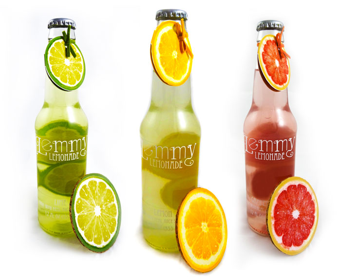
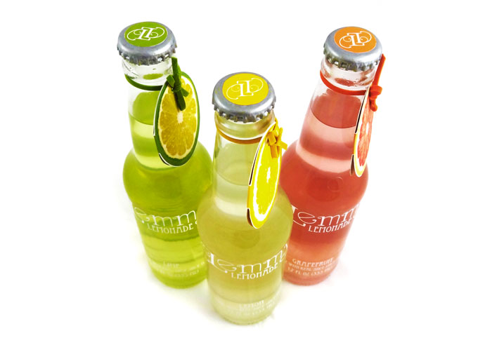
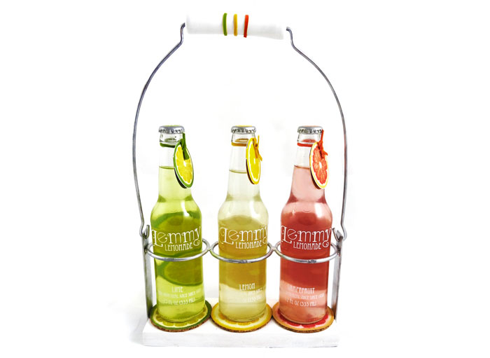
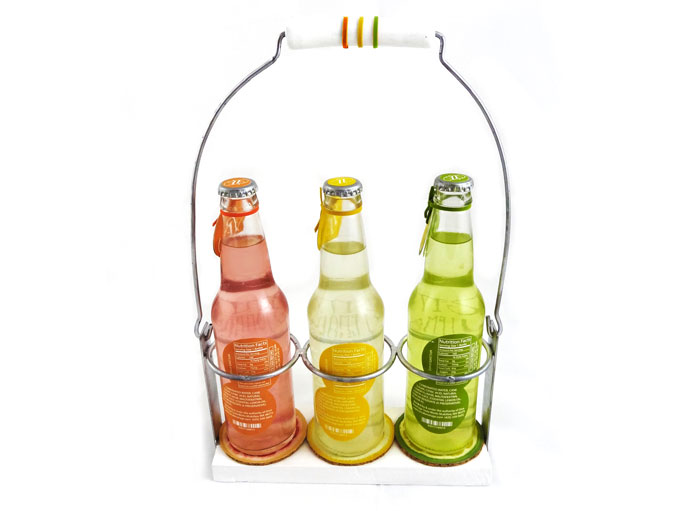
A rebrand of a 1935 sparkling lemonade that gets a “freshly squeezed” look. The packaging accentuates the bright, natural colors of the citrus fruits and reminiscent of peeling a fresh piece of fruit in the summer. The rebranded logo is a hand drawn to mimic a citrus peel curling and juice droplets hanging to the peel. To accomplish an “old fashion” feel, I repurposed a vintage soda bottle carrier. The carrier gives the package a nostalgic feel and is strong and reusable. The nutrition label also serves a dual purpose; as the soda is drunk the label shows as sliced citrus wheels.